Hey readers! This blog is nice to look at, no? But also a little difficult to navigate, yes? The archives and links and subscription box are all piled at the bottom, and you have to scroll waaaaaaaaaay down to see them. I want this blog to be easy to navigate, so I’m thinking of doing away with the giant, sparkling, roomy wordpress theme I have now, and going back to a wordpress theme that is much less glamorous, but with a sidebar where you can easily access the archives and things.
So here are the three themes that I like. And then there’s a poll. Tell me in the poll which one you like the best!
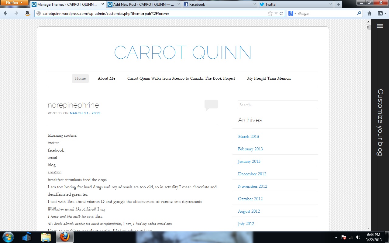
theme one!
..

theme two! (this one is hilarious, no?)
..

theme three! (this is my old theme)
..
Ok now take this poll. Thank you!
..

Wow…it looks like I’m the first voter! I was torn between Theme One and Theme Three. I really liked the clean look of Theme one, but having the photo in Theme Three really adds personality and flavor. Theme Two just looked too negative to me.
Dang…this is a trick question, right? You were going to pick Three all along and you’re just testing us! (Ha…I’m being silly!)
Also, I really love that photo!
Theme 2 is nostalgic for me, the old Apple MacIntosh document format. Don’t laugh, my girl and I brought a Mac in the trunk when we moved from Wash DC to San Francisco in 1987. And a dot matrix printer. We did our resumes and cover letters on it and managed to get good jobs and stick in that town. Those were some excellent days.
But I vote for theme 3. Yeah, that photo was inspired, I am very fond of it too.
The first two just seem so bland! No.3 breathes life because of the color! Just my opinion!